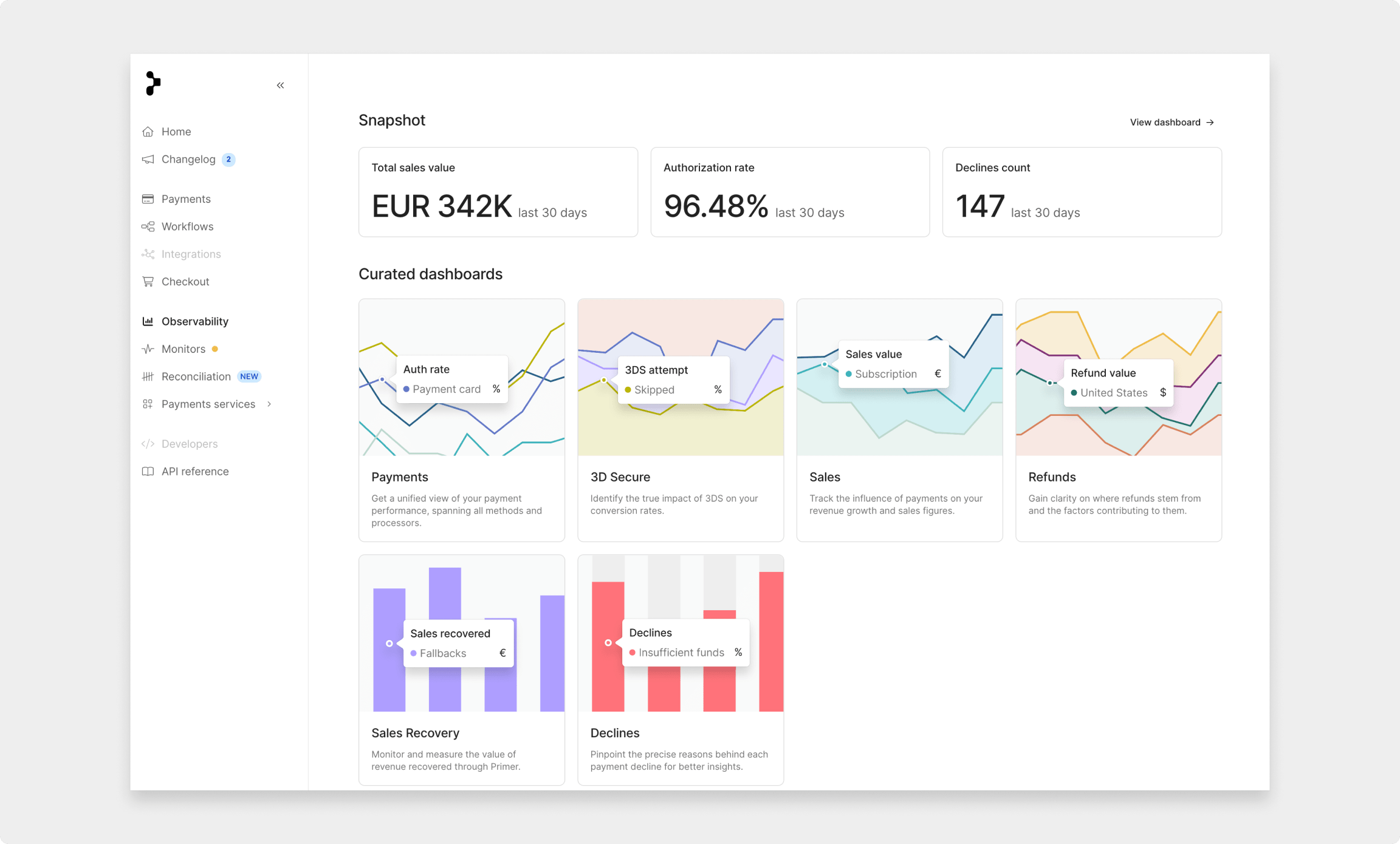
Data is automatically populated in Dashboards as soon as payments are processed through Primer. To begin, click on "Dashboards" in the Observability sidebar. Here, you'll find our curated payments dashboards, expertly tailored to provide insights into different facets of your payment processes.

Our curated dashboards group payment metrics into key areas, giving you an in-depth look at specific aspects of your payments. This allows you to analyze details and enhance your payment efficiency, ultimately boosting your conversion rates.

Date Filtering

By default, dashboards show the past 30 days of data, grouped by day. Change the date range using the date picker and adjust the grouping to your liking. For example, you can group data by hour, day, or week when looking at the last 30 days or even by the hour or minute when viewing a single day of data.


Currency Conversion

We let you convert sales data into the currency of your choice. This means the charts will reflect this conversion when showing a value metric. You can customize your default currency settings in your account preferences and use the drop-down menu to update when viewing a specific chart or Dashboard.

Filters

There is a wide array of over 30 filters to choose from to drill down into the exact details you want to view. These filters are incredibly powerful, allowing you to refine your data and focus on what's most relevant to you.

Filters can be applied by selecting “add filter” from the filters drawer. Each filter has operators:

  • Equals - the selected filter is equal to one of the values added
  • Not equals - the selected filter is equal to none of the values added
  • Between - the selected filter is between the minimum and maximum values
  • Is null - the selected filter does not have any value
  • Is not null - the selected filter has any value

When you apply filters, they are automatically applied to each chart within a dashboard. This ensures that your data remains consistent and tailored to your specific needs. Even if you switch between different curated dashboards using the "Switch Dashboard" button, your chosen filters will stay in place, providing you with a seamless and continuous view of your payment data.

The applied filters are shown in a list under the date picker and can be cleared by selecting the cross.

ℹ️

View the full list of available filters and their definitions here

Chart Interactions

To enhance your experience with our dashboards, we've incorporated several interactive features that allow you to delve into your data with ease. These chart interactions provide valuable insights and make data exploration a breeze.

Hover

When you hover your mouse cursor over a chart value, it reveals a summary of the metric value for the specific day/date range you're hovering over. To fix the hover information in place for the specific value, click on the legend corresponding to the value you're interested in. This action "fixes" the hover information in place for your convenience. To remove the fixed hover information, click again on the value in the legend or click off the chart. This deselects the item and allows you to explore other metrics.

In cases where there are too many values to fit within the ledger, the full list opens in a scrollable container. Values can be selected and de-selected in the same way in this container.


View lists of individual payments

Click on a specific value within a chart to explore the individual payments that make up that data. This action opens a new module containing a list of all payments related to the selected value. From the list of payments, you can click on each individual payment to access a detailed view in the Payments section of the Primer Dashboard.


Pagination on charts

Some charts (for example, the decline reasons charts in the Declines Dashboard) do not include a date grouping, instead, the dimension values are used for the x-axis. If there are too many values to fit within the chart, you paginate through the data using the toggles on the left-hand side of the chart.

Exploring Table Chart Data

For table chart types, clicking "View More Data" opens up a new page, providing you with an expanded view of the data. This feature is particularly useful when you need to examine larger datasets in detail.

Further filters can be applied from the view more data page.