> ## Documentation Index
> Fetch the complete documentation index at: https://primer.io/docs/llms.txt
> Use this file to discover all available pages before exploring further.
# Web
This guide is designed to help you style our default Universal Checkout UI. If you would like to build your own UI from scratch then check out our [Headless Universal Checkout guide](/docs/checkout/headless/).
## Localization and languages
### Set the locale
Universal Checkout supports multiple languages out of the box, enabling you to adapt its UI to the relevant market.
You can specify the language using the `locale` option. If not provided, the locale is automatically derived from the browser:
```typescript Typescript theme={"dark"}
const options = {
/* Other checkout options ... */
locale: 'fr-FR', // Renders Universal Checkout in French
}
```
Universal Checkout automatically falls back to English if the provided locale is not supported.
### Supported locales
| Locale | Language | Minimum versions |
| ------ | ---------------------------------------------------- | ---------------- |
| ar | Arabic | v1.22.1 |
| bg-BG | Bulgarian (Bulgaria) | v2.1.1, v1.37.0 |
| cs-CZ | Czech (Czech Republic) | v2.3.0, v1.38.0 |
| da-DA | Danish | v1.22.1 |
| de-DE | German | v1.22.0 |
| el-GR | Greek (Greece) | v1.22.1 |
| en-US | English (United States) | v1.0.0 |
| es | Spanish | v1.22.0 |
| es-AR | Spanish (Argentina) | v2.2.1 |
| et-EE | Estonian (Estonia) | v2.3.0, v1.38.0 |
| fr-FR | French (France) | v1.19.0 |
| hr-HR | Croatian (Croatia) | v2.3.0, v1.38.0 |
| hu-HU | Hungarian (Hungary) | v1.18.0 |
| it-IT | Italian (Italy) | v2.1.1, v1.37.0 |
| ja-JP | Japanese (Japan) | v2.3.0, v1.38.0 |
| lt-LT | Lithuanian (Lithuania) | v2.3.0, v1.38.0 |
| ms | Malay | v2.26.1 |
| nb-NO | Norwegian (Norway) | v1.22.1 |
| nl-NL | Dutch (Netherlands) | v1.22.1 |
| pl-PL | Polish (Poland) | v1.22.1 |
| pt-BR | Portuguese (Brazil) | v2.3.0, v1.38.0 |
| pt-PT | Portuguese (Portugal) | v1.22.0 |
| ro-RO | Romanian (Romania) | v1.37.0 |
| ru-RU | Russian (Russia) | v2.1.1, v1.37.0 |
| sk-SK | Slovak (Slovakia) | v2.1.1, v1.37.0 |
| sv-SE | Swedish (Sweden) | v1.22.1 |
| th | Thai | v2.26.1 |
| tr-TR | Turkish (Turkey) | v1.22.1 |
| vi-VN | Vietnamese (Vietnam) | v2.3.0, v1.38.0 |
| zh-CN | Chinese (Mainland China - Simplified characters) | v2.26.1 |
| zh-HK | \[BETA] Chinese (Hong-Kong - Traditional characters) | v2.26.1 |
| zh-TW | \[BETA] Chinese (Taiwan - Traditional characters) | v2.26.1 |
### Right-to-left
Universal Checkout automatically switches to a right-to-left layout for the relevant languages.
Make sure to pass the right `locale` to activate right-to-left:
```typescript Typescript theme={"dark"}
const options = {
/* Other checkout options ... */
locale: 'ar-AR', // Renders Universal Checkout in Arabic with right-to-left layout
}
```
## Styling Universal Checkout
For styling Universal Checkout, do not use custom CSS. Rather pass the `style` object as a checkout option when calling `showUniversalCheckout`.
You can use the general styling options to style specific UI elements such as form inputs, text labels and several other elements within Universal Checkout.
```typescript Typescript theme={"dark"}
const options = {
/* Other checkout options ... */
style: {
/* Style options */
},
}
```
### Text Styling Options
Text elements within Universal Checkout can be styled using the following interface:
```typescript Typescript theme={"dark"}
interface TextStyle {
color?: string
fontFamily?: string
fontWeight?: string
fontSize?: string
fontSmoothing?: string
lineHeight?: string
textTransform?: string
letterSpacing?: string
}
```
### Block Styling Options
Block elements within Universal Checkout can be styled using the following interface:
```typescript Typescript theme={"dark"}
interface BlockStyle {
background?: string
borderRadius?: number | string
boxShadow?: string
borderStyle?: string
borderColor?: number | string
borderWidth?: number | string
}
```
Both of the above mentioned interfaces will be referred to regularly in this guide when covering the styling of specific UI elements.
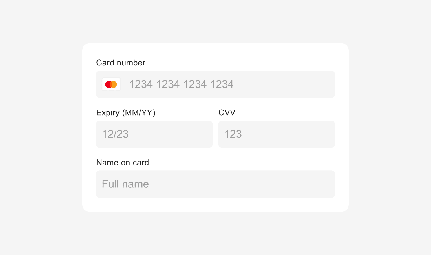
## Styling Inputs
### Styling Font Family (Card Input)
Universal Checkout style inherits from the style of its container as most of it is rendered directly within your page and not within an `iframe.`
So any `font-family` that you have set in the CSS file will be used by the Universal Checkout. The example below uses `MyFont` as the preferred font family for card input.
```css CSS theme={"dark"}
#my-checkout {
font-family: 'MyFont', sans-serif;
}
```
However, in order to be fully PCI-compliant, the card code field, the card expiry field and the CVV field are rendered in isolated `iframe`. This means that `font-family` declarations, and `@font-face` directives that load and define fonts are not passed to these specific fields.
To forward `font-family` and `@font-face` to the card input fields, you can set `style.input.base.fontFamily` and `style.fontFaces`.
Alternatively, to `style.fontFaces`, you can forward stylesheets to the `iframe` using the `style.stylesheets` option, which facilitates the integration of fonts coming from services such as Google Fonts.
```typescript Typescript theme={"dark"}
const options = {
/* Other options ... */
style: {
/* Forwarded to iframes */
fontFaces: [
{
fontFamily: 'Open Sans',
src: 'url("/fonts/OpenSans-Regular-webfont.woff2") format("woff2"), url("/fonts/OpenSans-Regular-webfont.woff") format("woff")',
},
],
/* Forwarded to iframes */
stylesheets: [
{
href: '',
},
],
/* Unified across all inputs: inside and outside iframes */
input: {
base: {
fontFamily: 'Open Sans',
},
},
},
}
```
### InputStyle Options
You can style all the inputs on Universal Checkout in all their different states.
By default, the `InputStyle` defined in `input:base` will be used everywhere. You need to add value for `InputStyle` only if you wish to override this style for inputLabel, hover, placeholder etc.
```typescript Typescript theme={"dark"}
interface InputStyle {
height?: number
paddingHorizontal?: number
background?: string
borderRadius?: number | string
boxShadow?: string
borderStyle?: string
borderColor?: string
borderWidth?: number | string
color?: string
fontFamily?: string
fontWeight?: string
fontSize?: string
fontSmoothing?: string
lineHeight?: string
}
```
```typescript Typescript theme={"dark"}
interface CheckoutStyle {
// Input styling
input?: {
// Base style
base?: InputStyle & {
hover?: InputStyle // :hover
focus?: InputStyle // :focus
placeholder?: InputStyle // ::placeholder
webkitAutofill?: InputStyle // :-webkit-autofill
selection?: InputStyle // ::selection
}
// Style of the label displayed above the input fields
inputLabel?: TextStyle
}
}
```
#### Example
 ```typescript Typescript theme={"dark"}
const options = {
/* Other options ... */
style: {
inputLabel: {
fontFamily: 'courier new',
color: '#000000',
},
input: {
base: {
borderStyle: 'none none solid none',
borderColor: '#000000',
boxShadow: '0px',
background: '#ffffff',
fontFamily: 'courier new',
borderRadius: '0px',
paddingHorizontal: '0px',
lineHeight: '',
color: '#000000',
placeholder: {
color: '#e1deda',
},
},
},
},
}
```
You can hide the default input labels using the `inputLabelsVisible` option.
```typescript Typescript theme={"dark"}
const options = {
/* Other options ... */
form: {
inputLabelsVisible: false,
},
}
```
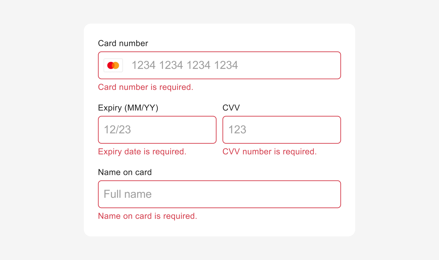
### Styling Input Errors
You can customize the style of Universal Checkout error state.
By default, the `InputStyle` defined in `input.base` will be used everywhere. But you can override this where you need different error message styling by specifying the style for `input.error` and `inputErrorText`. `inputErrorText` also uses `TextAlignmentStyle`.
```typescript Typescript theme={"dark"}
interface TextAlignmentStyle {
textAlign?: string
}
```
```typescript Typescript theme={"dark"}
const options = {
/* Other options ... */
style: {
input: {
error:
InputStyle &
{
hover: InputStyle,
focus: InputStyle,
placeholder: InputStyle,
webkitAutofill: InputStyle,
selection: InputStyle,
},
},
// Style of the error messages displayed below the input fields
inputErrorText: TextStyle & TextAlignmentStyle,
},
}
```
#### Example
```typescript Typescript theme={"dark"}
const options = {
/* Other options ... */
style: {
inputLabel: {
fontFamily: 'courier new',
color: '#000000',
},
input: {
base: {
borderStyle: 'none none solid none',
borderColor: '#000000',
boxShadow: '0px',
background: '#ffffff',
fontFamily: 'courier new',
borderRadius: '0px',
paddingHorizontal: '0px',
lineHeight: '',
color: '#000000',
placeholder: {
color: '#e1deda',
},
},
},
},
}
```
You can hide the default input labels using the `inputLabelsVisible` option.
```typescript Typescript theme={"dark"}
const options = {
/* Other options ... */
form: {
inputLabelsVisible: false,
},
}
```
### Styling Input Errors
You can customize the style of Universal Checkout error state.
By default, the `InputStyle` defined in `input.base` will be used everywhere. But you can override this where you need different error message styling by specifying the style for `input.error` and `inputErrorText`. `inputErrorText` also uses `TextAlignmentStyle`.
```typescript Typescript theme={"dark"}
interface TextAlignmentStyle {
textAlign?: string
}
```
```typescript Typescript theme={"dark"}
const options = {
/* Other options ... */
style: {
input: {
error:
InputStyle &
{
hover: InputStyle,
focus: InputStyle,
placeholder: InputStyle,
webkitAutofill: InputStyle,
selection: InputStyle,
},
},
// Style of the error messages displayed below the input fields
inputErrorText: TextStyle & TextAlignmentStyle,
},
}
```
#### Example
 ```typescript Typescript theme={"dark"}
const options = {
/* Other options ... */
style: {
inputErrorText: {
fontFamily: 'courier new',
textAlign: 'left',
color: '#e70909',
},
inputLabel: {
fontFamily: 'courier new',
color: '#000000',
},
input: {
base: {
borderStyle: 'none none solid none',
borderColor: '#000000',
boxShadow: '0px',
background: '#ffffff',
fontFamily: 'courier new',
borderRadius: '0px',
paddingHorizontal: '0px',
lineHeight: '',
color: '#000000',
placeholder: {
color: '#e1deda',
},
error: {
borderStyle: 'solid',
borderColor: '#d0021b',
},
},
},
},
}
```
## Styling Error Messages
You can also style the error message shown in the event of an unsuccessful payment using `ErrorMessageStyle` interface which extends [Block Styling Options](#block-styling-options) and [Text Styling Options](#text-styling-options) mentioned above.
```typescript Typescript theme={"dark"}
// Error Message Interface
interface ErrorMessageStyle extends BlockStyle, TextStyle {
color?: string
}
// Example
const options = {
/* Other options ... */
style: {
errorMessage: ErrorMessageStyle,
},
}
```
Universal Checkout can display error messages, or you can create your own. Refer to [Configuring Error Message Guide](https://www.npmjs.com/package/@primer-io/checkout-web#%EF%B8%8F-error-message-options--callbacks) for details.
## Styling Form Spacing
You can change the vertical spacing between inputs or the spacing between labels and inputs by using the `formSpacings` properties.
```typescript Typescript theme={"dark"}
// Form Spacings Interface
interface FormSpacings {
betweenLabelAndInput?: string
betweenInputs?: string
}
// Example
const options = {
style: {
formSpacings: {
betweenLabelAndInput: '0px',
betweenInputs: '10px',
},
},
}
```
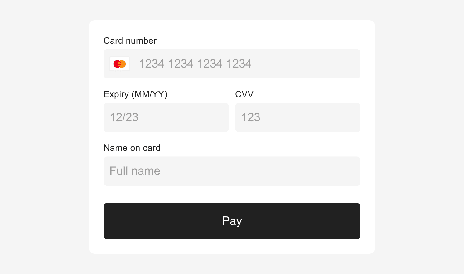
## Styling Submit Button
The default submit button in Universal Checkout can be styled to match your brand. The `submitButton` uses [TextStyle](#text-styling-options) and [BlockStyle](#block-styling-options) to define the style of the button.
By default, the style defined in `submitButton.base` will be used everywhere. If you wish to override the default style for loading, disabled, hover or focus or other states, you will be required to add values for [TextStyle](#text-styling-options) and [BlockStyle](#block-styling-options) properties.
```typescript Typescript theme={"dark"}
const options = {
/* Other options ... */
style: {
submitButton: {
base: {
hover: TextStyle & BlockStyle,
focus: TextStyle & BlockStyle,
},
disabled: {
hover: TextStyle & BlockStyle,
focus: TextStyle & BlockStyle,
},
loading: {
hover: TextStyle & BlockStyle,
focus: TextStyle & BlockStyle,
},
},
},
}
```
#### Example
```typescript Typescript theme={"dark"}
const options = {
/* Other options ... */
style: {
inputErrorText: {
fontFamily: 'courier new',
textAlign: 'left',
color: '#e70909',
},
inputLabel: {
fontFamily: 'courier new',
color: '#000000',
},
input: {
base: {
borderStyle: 'none none solid none',
borderColor: '#000000',
boxShadow: '0px',
background: '#ffffff',
fontFamily: 'courier new',
borderRadius: '0px',
paddingHorizontal: '0px',
lineHeight: '',
color: '#000000',
placeholder: {
color: '#e1deda',
},
error: {
borderStyle: 'solid',
borderColor: '#d0021b',
},
},
},
},
}
```
## Styling Error Messages
You can also style the error message shown in the event of an unsuccessful payment using `ErrorMessageStyle` interface which extends [Block Styling Options](#block-styling-options) and [Text Styling Options](#text-styling-options) mentioned above.
```typescript Typescript theme={"dark"}
// Error Message Interface
interface ErrorMessageStyle extends BlockStyle, TextStyle {
color?: string
}
// Example
const options = {
/* Other options ... */
style: {
errorMessage: ErrorMessageStyle,
},
}
```
Universal Checkout can display error messages, or you can create your own. Refer to [Configuring Error Message Guide](https://www.npmjs.com/package/@primer-io/checkout-web#%EF%B8%8F-error-message-options--callbacks) for details.
## Styling Form Spacing
You can change the vertical spacing between inputs or the spacing between labels and inputs by using the `formSpacings` properties.
```typescript Typescript theme={"dark"}
// Form Spacings Interface
interface FormSpacings {
betweenLabelAndInput?: string
betweenInputs?: string
}
// Example
const options = {
style: {
formSpacings: {
betweenLabelAndInput: '0px',
betweenInputs: '10px',
},
},
}
```
## Styling Submit Button
The default submit button in Universal Checkout can be styled to match your brand. The `submitButton` uses [TextStyle](#text-styling-options) and [BlockStyle](#block-styling-options) to define the style of the button.
By default, the style defined in `submitButton.base` will be used everywhere. If you wish to override the default style for loading, disabled, hover or focus or other states, you will be required to add values for [TextStyle](#text-styling-options) and [BlockStyle](#block-styling-options) properties.
```typescript Typescript theme={"dark"}
const options = {
/* Other options ... */
style: {
submitButton: {
base: {
hover: TextStyle & BlockStyle,
focus: TextStyle & BlockStyle,
},
disabled: {
hover: TextStyle & BlockStyle,
focus: TextStyle & BlockStyle,
},
loading: {
hover: TextStyle & BlockStyle,
focus: TextStyle & BlockStyle,
},
},
},
}
```
#### Example
 ```typescript Typescript theme={"dark"}
const options = {
/* Other options ... */
style: {
submitButton: {
base: {
color: '#ffffff',
background: '#000000',
borderRadius: '3px',
fontFamily: 'courier new',
fontWeight: 'bold',
boxShadow: 'none',
},
disabled: {
color: '#9b9b9b',
background: '#e1deda',
},
},
},
}
```
You can also use [custom submit button](#displaying-custom-submit-button) instead of styling the Universal Checkout default submit button.
## Styling Back Button
Some scenes in Universal Checkout will have a back button which allows the user to navigate back to the previous scene. You can style the back button as shown below:
```typescript Typescript theme={"dark"}
const options = {
/* Other options ... */
style: {
backButton: {
color: string,
},
},
}
```
## Styling Transitions
When multiple scenes are present in Universal Checkout, you can override the default transitions to better match your website transitions.
```typescript Typescript theme={"dark"}
type SceneOptions = {
// A callback for receiving the current scene that is entering
onEntering?: (sceneId: string) => void
// Specify options relating to scene transitions
// Setting to false disables all scene transitions
// Defaults to a 'SLIDE_UP' type transition with a duration of 700ms
transition?: SceneTransitionOptions | false
}
type SceneTransitionOptions = {
// The type of transition animation which will be used
type: TransitionType
// The duration of the transition animation
duration: number
}
type TransitionType = 'SLIDE_UP' | 'SLIDE_DOWN' | 'SLIDE_HORIZONTAL'
```
```typescript Typescript theme={"dark"}
const handleOnSceneEntering = (sceneId: string) => {
// perform action based on current scene being entered
}
const options = {
/* Other options ... */
// Example 1 - scene with custom transitions enabled
scene: {
onEntering: handleOnSceneEntering,
transition: {
type: 'SLIDE_DOWN',
duration: 650, // duration in milliseconds
},
},
// Example 2 - scene with all transitions disabled
scene: {
onEntering: handleOnSceneEntering,
transition: false,
},
}
```
## Styling Loading indicator
While Universal Checkout loads, a loading screen indicator is displayed to the customers. You can customize the color of the loading screen indicator as shown below:
```typescript Typescript theme={"dark"}
const options = {
/* Other options ... */
style: {
loadingScreen: {
// Color of the loading screen indicator
color: string,
},
},
}
```
## Styling Vault
By default, any previously vaulted payment methods are shown to customers in Universal Checkout. This happens only when the `customerId` is included in the [client session](/docs/checkout/client-session/).
```typescript Typescript theme={"dark"}
const options = {
/* Other options ... */
vault: {
// Fetch the vaulted payment methods for the customerId
//of the current session and display them
// Default to true
visible: boolean,
// Disable the option to delete a saved payment method.
// Default to false
deletionDisabled: boolean,
},
}
```
### Styling Vault Display
The vault display in Universal Checkout can be styled if you wish to change the defaults. `showMorePaymentMethodsButton` uses [TextStyle](#text-styling-options) to define the style of the button. By default, the style defined in `showMorePaymentMethodsButton.base` will be used everywhere. Add values for [TextStyle](#text-styling-options) only if you wish to override this style for the disabled state.
```typescript Typescript theme={"dark"}
const options = {
/* Other options ... */
style: {
showMorePaymentMethodsButton: {
base: TextStyle,
disabled: TextStyle,
},
},
}
```
You also have the option to style the edit icons and menu. The `actionButton` uses [TextStyle](#text-styling-options) to define the style of the button. The `confirmButton` uses both [TextStyle](#text-styling-options) and [BlockStyle](#block-styling-options) interfaces.
```typescript Typescript theme={"dark"}
// Pop-up menu to manage the vaulted payment methods
const options = {
/* Other options ... */
// Pop-up menu to manage the vaulted payment methods
vaultMenu: {
// Pencil icon
editButton: {
// Backround of the pencil icon
background: string,
// Color of the pencil icon
color: string,
},
item: {
label: textStyle,
// Delete & Cancel button
actionButton: TextStyle,
confirmButton: TextStyle & BlockStyle,
},
},
}
```
## Displaying Custom Errors
Universal Checkout can display error messages, or you can create your own. Refer to the [Configuring Error Message Guide](https://www.npmjs.com/package/@primer-io/checkout-web#%EF%B8%8F-error-message-options--callbacks) for details.
In case of an error, Universal Checkout presents a default message to the customers. This error message can be disabled if you wish to display a custom error message.
```typescript Typescript theme={"dark"}
const options = {
/* Other options ... */
errorMessage: {
// Disable the appearance of the
//default error message
// Default to false
disabled: boolean,
// A callback for when the error message
//should be displayed
onErrorMessageShow(message: string) {
// Choose to use provided message for own purposes
},
// A callback for when the error message
//should be hidden
onErrorMessageHide() {
// Update own UI accordingly
},
},
}
```
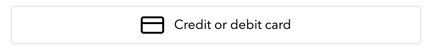
## Displaying Pay by Card Button
By default, the card form is automatically displayed on the first scene of Universal Checkout.
You can replace it and display a 'Pay by Card' button instead of the form. Clicking on the button will show the card form on another scene.
```typescript Typescript theme={"dark"}
const options = {
/* Other options ... */
style: {
submitButton: {
base: {
color: '#ffffff',
background: '#000000',
borderRadius: '3px',
fontFamily: 'courier new',
fontWeight: 'bold',
boxShadow: 'none',
},
disabled: {
color: '#9b9b9b',
background: '#e1deda',
},
},
},
}
```
You can also use [custom submit button](#displaying-custom-submit-button) instead of styling the Universal Checkout default submit button.
## Styling Back Button
Some scenes in Universal Checkout will have a back button which allows the user to navigate back to the previous scene. You can style the back button as shown below:
```typescript Typescript theme={"dark"}
const options = {
/* Other options ... */
style: {
backButton: {
color: string,
},
},
}
```
## Styling Transitions
When multiple scenes are present in Universal Checkout, you can override the default transitions to better match your website transitions.
```typescript Typescript theme={"dark"}
type SceneOptions = {
// A callback for receiving the current scene that is entering
onEntering?: (sceneId: string) => void
// Specify options relating to scene transitions
// Setting to false disables all scene transitions
// Defaults to a 'SLIDE_UP' type transition with a duration of 700ms
transition?: SceneTransitionOptions | false
}
type SceneTransitionOptions = {
// The type of transition animation which will be used
type: TransitionType
// The duration of the transition animation
duration: number
}
type TransitionType = 'SLIDE_UP' | 'SLIDE_DOWN' | 'SLIDE_HORIZONTAL'
```
```typescript Typescript theme={"dark"}
const handleOnSceneEntering = (sceneId: string) => {
// perform action based on current scene being entered
}
const options = {
/* Other options ... */
// Example 1 - scene with custom transitions enabled
scene: {
onEntering: handleOnSceneEntering,
transition: {
type: 'SLIDE_DOWN',
duration: 650, // duration in milliseconds
},
},
// Example 2 - scene with all transitions disabled
scene: {
onEntering: handleOnSceneEntering,
transition: false,
},
}
```
## Styling Loading indicator
While Universal Checkout loads, a loading screen indicator is displayed to the customers. You can customize the color of the loading screen indicator as shown below:
```typescript Typescript theme={"dark"}
const options = {
/* Other options ... */
style: {
loadingScreen: {
// Color of the loading screen indicator
color: string,
},
},
}
```
## Styling Vault
By default, any previously vaulted payment methods are shown to customers in Universal Checkout. This happens only when the `customerId` is included in the [client session](/docs/checkout/client-session/).
```typescript Typescript theme={"dark"}
const options = {
/* Other options ... */
vault: {
// Fetch the vaulted payment methods for the customerId
//of the current session and display them
// Default to true
visible: boolean,
// Disable the option to delete a saved payment method.
// Default to false
deletionDisabled: boolean,
},
}
```
### Styling Vault Display
The vault display in Universal Checkout can be styled if you wish to change the defaults. `showMorePaymentMethodsButton` uses [TextStyle](#text-styling-options) to define the style of the button. By default, the style defined in `showMorePaymentMethodsButton.base` will be used everywhere. Add values for [TextStyle](#text-styling-options) only if you wish to override this style for the disabled state.
```typescript Typescript theme={"dark"}
const options = {
/* Other options ... */
style: {
showMorePaymentMethodsButton: {
base: TextStyle,
disabled: TextStyle,
},
},
}
```
You also have the option to style the edit icons and menu. The `actionButton` uses [TextStyle](#text-styling-options) to define the style of the button. The `confirmButton` uses both [TextStyle](#text-styling-options) and [BlockStyle](#block-styling-options) interfaces.
```typescript Typescript theme={"dark"}
// Pop-up menu to manage the vaulted payment methods
const options = {
/* Other options ... */
// Pop-up menu to manage the vaulted payment methods
vaultMenu: {
// Pencil icon
editButton: {
// Backround of the pencil icon
background: string,
// Color of the pencil icon
color: string,
},
item: {
label: textStyle,
// Delete & Cancel button
actionButton: TextStyle,
confirmButton: TextStyle & BlockStyle,
},
},
}
```
## Displaying Custom Errors
Universal Checkout can display error messages, or you can create your own. Refer to the [Configuring Error Message Guide](https://www.npmjs.com/package/@primer-io/checkout-web#%EF%B8%8F-error-message-options--callbacks) for details.
In case of an error, Universal Checkout presents a default message to the customers. This error message can be disabled if you wish to display a custom error message.
```typescript Typescript theme={"dark"}
const options = {
/* Other options ... */
errorMessage: {
// Disable the appearance of the
//default error message
// Default to false
disabled: boolean,
// A callback for when the error message
//should be displayed
onErrorMessageShow(message: string) {
// Choose to use provided message for own purposes
},
// A callback for when the error message
//should be hidden
onErrorMessageHide() {
// Update own UI accordingly
},
},
}
```
## Displaying Pay by Card Button
By default, the card form is automatically displayed on the first scene of Universal Checkout.
You can replace it and display a 'Pay by Card' button instead of the form. Clicking on the button will show the card form on another scene.
 ```typescript Typescript theme={"dark"}
type CardPreferredFlow = 'DEDICATED_SCENE' | 'EMBEDDED_IN_HOME'
// Example
Primer.showUniversalCheckout(clientToken, {
// ...
card: {
preferredFlow: 'DEDICATED_SCENE', // Show the card form on a separate scene
},
})
```
You can assign the following values to `card.preferredFlow` field:
* `DEDICATED_SCENE`
* `EMBEDDED_IN_HOME` (default)
The style of the card form in the second dedicated scene remains defined by the `style.input` property. The pay with card button can also be styled, if you prefer not to use the default styling. See [Styling Payment Method Button](#styling-payment-method-button) for details.
## Styling Payment Method Button
The `paymentMethodButton` uses [TextStyle](#text-styling-options) to define the style of the button.
```typescript Typescript theme={"dark"}
const options = {
/* Other options ... */
style: {
paymentMethodButton: {
background: string,
borderRadius: number | string,
boxShadow: string,
borderColor: string,
height: number,
primaryText: TextStyle,
logoColor: logoColor,
marginTop: string,
},
},
}
```
## Displaying Custom Submit Button
The Universal Checkout now enables you to use your own custom submit button. Follow these three simple steps to replace default submit button with your own custom one:
### Step 1. Hide the Built-in Submit Button
```typescript Typescript theme={"dark"}
const checkout = await primer.showUniversalCheckout(clientToken, {
submitButton: {
useBuiltInButton: false, // Hide the built-in submit button
},
})
```
### Step 2. Forward clicks to checkout.submit()
```typescript Typescript theme={"dark"}
const checkout = await primer.showUniversalCheckout(clientToken, options)
const handleMySubmitButtonClick = e => {
checkout.submit()
}
```
### Step 3. Dynamically Update Your Submit Button
The Universal Checkout expects the submit button to be visible and enabled in specific conditions. You don't have to care about these conditions - the Universal Checkout will tell you when and how to display the Submit Button.
```typescript Typescript theme={"dark"}
const checkout = await primer.showUniversalCheckout(clientToken, {
/* Other options ... */
submitButton: {
useBuiltInButton: false, // Hide the built-in submit button
// The Universal Checkout expects the button to be showed or hidden
onVisible: (isVisible: boolean) => {
// Show / Hide the submit button
},
// The Universal Checkout expects the button to be enabled or disabled
onDisable: (isDisabled: boolean) => {
// Enable / Disable the submit button
},
// The Universal Checkout expects the button to have a loading indicator
// to indicate that it is processing/loading something
// "isLoading: true" also means that the button is disabled
onLoading: (isLoading: boolean) => {
// Set the submit button to loading or not
},
// Set the content of your submit button
onContentChange: (content: string) => {
// Set the text content of the submit button
},
},
})
```
These callback functions are called every time the scene changes.
### Handle Multiple Submit Buttons
Each callback has a second argument called `context` with the `currentSceneId`. This enables you to determine which submit button to show/hide, enable/disable, or modify the content.
In addition, the `onVisible` callback also contains `previousSceneId` in the context object. This enables you to hide the button of the previous scene if necessary.
```typescript Typescript theme={"dark"}
const getSubmitButtonFromSceneId = (sceneId: string) => {
if (sceneId === 'UniversalCheckout/Home') {
return 'SideButton'
} else if (sceneId === '...') {
return 'TopButton'
}
return 'BottomButton'
}
const onVisible = (isVisible, context) => {
const { prevousSceneId, currentSceneId } = context
if (!isVisible) {
hideAllSubmitButtons()
} else {
hideSubmitButton(getSubmitButtonFromSceneId(previousSceneId))
showSubmitButton(getSubmitButtonFromSceneId(currentSceneId))
}
}
const onContentChange = (content, context) => {
const { currentSceneId } = context
setSubmitButtonContent(getSubmitButtonFromSceneId(currentSceneId), content)
}
```
## Success Screen
By default, what happens after `onTokenizeSuccess` depends on the payment method that the customer chooses. Some of them require the display of a screen that summarizes the order.
It is recommended best practice to show a success screen once the payment is validated. You can use the `successScreen` options to determine whether to show a built-in success screen or a custom one.
The available built-in success screen types are `'PAYMENT_METHOD'` and `'CHECK'`.
The default `successScreen` used when no type is defined is `'CHECK'`.
```typescript Typescript theme={"dark"}
type CardPreferredFlow = 'DEDICATED_SCENE' | 'EMBEDDED_IN_HOME'
// Example
Primer.showUniversalCheckout(clientToken, {
// ...
card: {
preferredFlow: 'DEDICATED_SCENE', // Show the card form on a separate scene
},
})
```
You can assign the following values to `card.preferredFlow` field:
* `DEDICATED_SCENE`
* `EMBEDDED_IN_HOME` (default)
The style of the card form in the second dedicated scene remains defined by the `style.input` property. The pay with card button can also be styled, if you prefer not to use the default styling. See [Styling Payment Method Button](#styling-payment-method-button) for details.
## Styling Payment Method Button
The `paymentMethodButton` uses [TextStyle](#text-styling-options) to define the style of the button.
```typescript Typescript theme={"dark"}
const options = {
/* Other options ... */
style: {
paymentMethodButton: {
background: string,
borderRadius: number | string,
boxShadow: string,
borderColor: string,
height: number,
primaryText: TextStyle,
logoColor: logoColor,
marginTop: string,
},
},
}
```
## Displaying Custom Submit Button
The Universal Checkout now enables you to use your own custom submit button. Follow these three simple steps to replace default submit button with your own custom one:
### Step 1. Hide the Built-in Submit Button
```typescript Typescript theme={"dark"}
const checkout = await primer.showUniversalCheckout(clientToken, {
submitButton: {
useBuiltInButton: false, // Hide the built-in submit button
},
})
```
### Step 2. Forward clicks to checkout.submit()
```typescript Typescript theme={"dark"}
const checkout = await primer.showUniversalCheckout(clientToken, options)
const handleMySubmitButtonClick = e => {
checkout.submit()
}
```
### Step 3. Dynamically Update Your Submit Button
The Universal Checkout expects the submit button to be visible and enabled in specific conditions. You don't have to care about these conditions - the Universal Checkout will tell you when and how to display the Submit Button.
```typescript Typescript theme={"dark"}
const checkout = await primer.showUniversalCheckout(clientToken, {
/* Other options ... */
submitButton: {
useBuiltInButton: false, // Hide the built-in submit button
// The Universal Checkout expects the button to be showed or hidden
onVisible: (isVisible: boolean) => {
// Show / Hide the submit button
},
// The Universal Checkout expects the button to be enabled or disabled
onDisable: (isDisabled: boolean) => {
// Enable / Disable the submit button
},
// The Universal Checkout expects the button to have a loading indicator
// to indicate that it is processing/loading something
// "isLoading: true" also means that the button is disabled
onLoading: (isLoading: boolean) => {
// Set the submit button to loading or not
},
// Set the content of your submit button
onContentChange: (content: string) => {
// Set the text content of the submit button
},
},
})
```
These callback functions are called every time the scene changes.
### Handle Multiple Submit Buttons
Each callback has a second argument called `context` with the `currentSceneId`. This enables you to determine which submit button to show/hide, enable/disable, or modify the content.
In addition, the `onVisible` callback also contains `previousSceneId` in the context object. This enables you to hide the button of the previous scene if necessary.
```typescript Typescript theme={"dark"}
const getSubmitButtonFromSceneId = (sceneId: string) => {
if (sceneId === 'UniversalCheckout/Home') {
return 'SideButton'
} else if (sceneId === '...') {
return 'TopButton'
}
return 'BottomButton'
}
const onVisible = (isVisible, context) => {
const { prevousSceneId, currentSceneId } = context
if (!isVisible) {
hideAllSubmitButtons()
} else {
hideSubmitButton(getSubmitButtonFromSceneId(previousSceneId))
showSubmitButton(getSubmitButtonFromSceneId(currentSceneId))
}
}
const onContentChange = (content, context) => {
const { currentSceneId } = context
setSubmitButtonContent(getSubmitButtonFromSceneId(currentSceneId), content)
}
```
## Success Screen
By default, what happens after `onTokenizeSuccess` depends on the payment method that the customer chooses. Some of them require the display of a screen that summarizes the order.
It is recommended best practice to show a success screen once the payment is validated. You can use the `successScreen` options to determine whether to show a built-in success screen or a custom one.
The available built-in success screen types are `'PAYMENT_METHOD'` and `'CHECK'`.
The default `successScreen` used when no type is defined is `'CHECK'`.
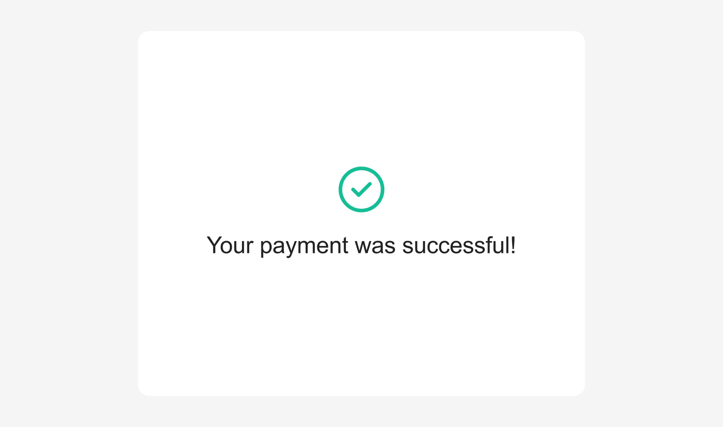
### Custom Title
When using `'CHECK'` as a success screen type, it is also possible to specify a custom success title which will be displayed under the success check mark icon.
```typescript Typescript theme={"dark"}
await primer.showUniversalCheckout(clientToken, {
/* Other options ... */
successScreen: {
type: 'CHECK',
title: 'My custom title',
},
})
```
Setting `successScreen` to `false` overrides the default behavior so that you can show a custom success screen after `onTokenizeSuccess` is called:
```typescript Typescript theme={"dark"}
await primer.showUniversalCheckout(clientToken, {
/* Other options ... */
successScreen: false,
})
```
## Further Information
To find out more, explore the [full API in our npm docs](https://www.npmjs.com/package/@primer-io/checkout-web).
If there is anything beyond the styling options listed above that you’d like to modify or change, do get in touch with our support team.